Thursday, 29 May 2008
Saturday, 24 May 2008
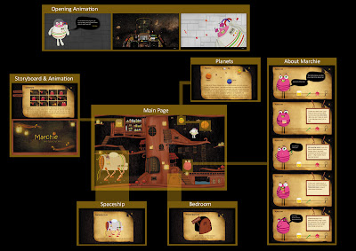
opening animation1

1. the control panel where marchie wass facing, showing the outer view of space, very peaceful as in no big obstacles that's blocking his way to Planet Peepo
2. In the 1st hour, Marchie was very exciting as this was the first time
3. 2nd hour, not excited and started to feel bored and tired
4. coming 3rd hour, Marchie was no longer excited, feeling tired and sleepy
5. .... (fall asleep)
6. a huge meteorite was just in front of Marchie! The whole spaceship was in dangerous mode, warning sign on the screen and red lights were all on
7. but he had no realization and still in his sleeping wonderland
8. collision between spaceship with a giant meteorite
9. spaceship were knocked down and landed on earth
Evaluation 4
[online evaluation by my SIG tutor: Andrew Pearsall]
looks good but your style seems to missing in the design of the cockpit of the spaceship, it reminds me of a plane emulation game and miss's some of your humor and illustrative style. animates well
[Comments from friends]
- looking good but seems that your illustrative style and the photo collage were not matching, in another word, no consistent
- don't really get the message, why jumping scene showing spaceship then marchie then spaceship
- since my audience saying the message is not clear, so my next step will be creating a short dialouge box at the bottom of my animation or maybe showing a static image with story lines describing where Marchie is heading to, what's his purpose and why is he on the spaceship before opening animation
Thursday, 22 May 2008
user testing evaluation
- ok...first, ur illustration is very very nice!! i like it so much! ><
- the overall color is brownish rite.. so those things that more outstanding like the marchi ..the m44..and the planet will make a differences ..make me wana click on it. and also they are animating..so make me wan to click on it..
- enhance on the animating part, make the clickable object more outstanding (may be animate more or add some indications showing tat they are clickable cos some other part like the water licking the firebugs at the left up corner and also the space man under the planet)
- most of the animating part are in equal speed and very consistant..so make me a bit confuse which is clickable actually and which is only animation.. or u wan ppl to explore themselves? but wil make ppl miss out one sometimes. like the door M at the bottom..i don realli know it is clickable..
- so u take a look on them about clickable items and only animated items
- the mushroom is cute!! i expect something wil happen when roll over it or click on it..now roll over it they jump rite..may be can make it when user roll over it they jump..when click on it..then got bug coming out from the mushroom then run away..hahahahah~
- ok...for the bg..a bit quiet and static..may be u can make the fire bugs slowly fly thru the whole scene ..can add more eye catchy feeling ma..so might feel like more things to see like tat..
- who is the main characters? the marchie itself or wat? if it is the marchie itself..he is not obvious enuf showing tat he is main character..may be u can make it walk a bit then sit..hahaha~
- menu at the up right corner not obvious enuf la! i think u can make them a bit out from the scene like got a depth between..will be better may be..
- just some details and user experience part u need to take care of it
- overall is lack of wordings ..all are graphics rite..can add some words or text to indicate something may be..so it will look more complete as a website..
- of course sound effects! hahaa.. like water sound..night ambience those bug singing sound..a bit space ambience..
case study- Pocoyo
Action points
- opening animation (animation showing how marchie end up on earth)
- mushroom sounds very metallic (change to "boink boink", cute sound)
- random animation for spider, mushroom, fire flies and etc
- English check
- rollover button (look into scripting problem)
- spaceship (little menu popping out instead of the whole page)
- some little animation for spaceship (pick up screw and put into the spaceship and see what happen, small screen viewing how it fall/ land on earth)
- fire flies (experiment into sound effect: mouse go nearer the target and sounds get louder)
- liquid jar (add in Marchie's teeth)
- tool tip
- rocks (rollover and it swings)
- animation (take away the credits, a back button to return to main page)
- door (signage: do not disturb! or voice over/ hole to peep inside/ knock knock)
- About Marchie page (type too small, can't read)
- add in animation like pocoyo website, showing the personality and who marchie is
- further animation on bad breath/ spaceship to give a clearer picture of marchie's background and history
- research on character development
- character study, case studies
- VSP
Evaluation 3
Key points raised during tutorial: there needs to be some final enhancement to complete the site which highlights- perhaps add further animations which gives the character a background and history.
Tuesday, 13 May 2008
20 tips for interactive designers
1 Aim at your audience
Be mindful of your target audience. Get to know who they are and what kit they use. It’s a disaster if you’re making a full-on interactive site using the latest version of the Flash Player – with all the bells and whistles available to you – if most of your audience won’t see any of it because they still have Flash Player 6. It’s also good to bear in mind those design features which are available only in Flash 8. Bevels, glows and drop shadows can be cool, but not if they can’t be seen. Don’t fall into the trap of thinking that viewers with anything less than Flash Player 9 will see your designs without the effects, because what they’ll actually see is a large white area with nothing in it at all!
2 Keep focused
Tom Harding, designer at WeeWorld believes that you can avoid losing focus on a project by asking yourself a series of questions related to the project. “Be it for the web, a kiosk, CMS, DVD or mobile, these questions should apply: Who will use what you’re creating once it’s complete? What environment will they be in? What tool will they interact with and how will this affect the design? Most importantly, what information or experiences do they want to gain from interacting with your project? Ask yourself these questions again and again throughout the development of your project to see if you’re still on brief,” says Harding.
3 Test your site
User testing can be a painful process. You may think anyone who can’t find that button back to the homepage is an idiot, but it’s good to identify these issues early on. Find out how user-friendly your website, mobile interface or DVD menu is, by getting your friends and family to test your work for you. Listen to their opinions and act on them. Be sure to test your interactive designs on different types of set-ups too. DVDs should be tested on widescreen and 4.3 TV sets and home computers, and websites should be previewed on different browser set-ups and different screen resolutions. This is vital for any content that can’t easily be withdrawn, such as on a DVD.
4 Make it simple
Visitors to your website should be bowled over with its richness of design and interactivity. When it comes to signup forms or search boxes, however, keep them as straightforward and as obvious as possible. Ask only for pertinent information – don’t request people’s life stories, because interactivity should be fluid and immediate.
5 Boost your rankings
When you finish building and designing your all-singing all-dancing website, it’s not much fun if only mum, dad and your best mate come to visit. Ensure all the important keywords appear in the title, description, Alt tags and content of your web pages. This will improve your keyword density and, in turn, will boost your ranking in the search engines.
6 Keep up with new technology
Tom Kershaw works across all of the BBC radio websites. For him, education is key to creating successful interactive sites, as he explains: “Keep up with new and emerging technologies. This doesn’t mean going home and studying – it could simply mean subscribing to your favourite magazine, or keeping an eye on some current websites. Some sites that are worth checking regularly are A List Apart, Zen Garden and The Web Developer’s Handbook – the Swiss Army Knife for web development. Keeping up with new technologies might mean using AJAX to make the user experience faster, easier and more fluid, but whichever way you decide to use these tools, they’ll be shaping the web above and beyond the 2.0 era as we move towards a more desktop-like internet.”
7 Font types and sizes
Designing for a computer screen is not the same as designing for interactive television or DVD. There’s a greater viewing distance for a TV, so fonts need to be much larger than on a computer screen. 12pt text simply isn’t going to work, so keep your font sizes at 30pt minimum. Be careful with serif fonts too –televisions flicker because of interlacing, making serifs hard to read, so use a font designed specifically for television or one that’s a slab serif font. Have a TV monitor hooked up from your computer so you can use it for testing purposes. This is not only good for testing font sizes but will also enable you to check colour temperatures. The difference in these between TV and a computer can be quite shocking – computers have a much higher resolution and display colour temperatures differently.
8 Think modular
Use the ‘loadMovie’ function in Flash to load SWFs. These will enhance the user experience by cutting down on initial site load times. Create a container movie and from that load movies in and out of it. This makes the experience of using the site more seamless and ‘interactive’. Don’t put everything in one SWF – the lengthy load time alone will make visitors go elsewhere. Images, video and content SWFs should all be loaded on demand.
9 Be creative with layouts
‘Functional and usable’ doesn’t have to translate into ‘duller than dishwater and boring’. The challenge of being a designer of interactive content is to find a middle ground between great functioning interactivity and inspiring, original creativity. Experiment with different layouts and schemes until you get a balance of content and functionality – in other words, wow-factor visuals and intuitive navigation.
10 Correct ratios
Computer screen pixels are square; on a television they’re rectangular. Photoshop enables you to create graphics in the correct ratio by selecting Image>Pixel Aspect Ratio. Here you can make sure that circles don’t become ovals when viewed on a TV set by switching between square and rectangular pixels. Try and get into the habit of using this tool because it takes the guesswork out of creating graphics across different types of media.
11 Interactive menus
Mark Bulley, web producer for Square Enix, has recently completed work on the site for the PlayStation 2 game Kingdom Hearts. He’s got this advice for designers: “Make use of interactive menus within your site, because these bring depth and make your site stick out from the rest. On the Kingdom Hearts site, I used tools such as 3D Studio Max, After Effects and Flash to create a fluid carousel as a navigation device for the site. I used a lot of modelling, texturing and rendering to achieve this effect, which, although time consuming, pays off with the visual effects you can achieve.”
12 Compress video files
Sorenson Squeeze is a piece of kit which is a lifesaver for anyone working with video delivery on the web. It’s an amazing video compression suite which uses the Sorenson Spark codec to make mincemeat of bloaty video files. Export as Windows Media, MPEG 1 and 2, QuickTime, Real, SWF, FLV and AVI. Streaming media can also be exported and videos can be trimmed before you export them.
13 Make DVD text clickable
Bear in mind that DVD menus are also used on computers and controlled by mouse-clicks rather than remote controls. Some DVD interfaces use highlighted graphic areas rather than clickable text on screen and these can be quite hard to find when using a mouse. When designing menus, ensure you make all text next to your buttons clickable. This will remove the pain and frustration experienced by computer viewers desperately trying to figure out where to click on a menu screen.
14 Improved preloader
“Skip intro?” Well, okay, I will. It’s disheartening to think of all those finely crafted animations being ignored across the web, so you need to be a little smarter with your Flash work. Stop the madness of looping animations and create a preloader whose animation changes as more bytes are loaded. The result should be functional and more visually interesting, rather than an intro movie which comes across as a hindrance for the visitor.
15 Push the limits
“Keep the design nice and simple”? Nonsense. That’s a phrase which often just means, “We couldn’t really be bothered to do that much design work.” Just because a menu system or layout looks clean and simple doesn’t mean it adds anything to the visitors’ overall experience. Stretch your creativity to the limits and make fantastic eye-popping menu systems which fit well with your overall design. Interactivity should be about fun, excitement and pushing the limits. Just remember to make your layouts and menus logical and intuitive. Nothing original was ever achieved by following the herd. Be experimental and break a few moulds.
16 Website structure
Oliver Davies is a project manager at FremantleMedia Ltd, where he works on TV properties such as Neighbours, The X Factor and The Bill. “Getting the information architecture right on the websites is vital in creating a good user experience,” says Davies. “Be clear about the site’s aims and who your target audience is. Write each content type on a Post-it, work out what’s in, what’s desirable and what’s out. Take the definites and maybes and group them into related subjects. Name your Post-it ‘piles’ and use them to draw a structure diagram for the site, like a family tree. This will help you work out a logical onscreen navigation system.”
17 Formatting Flash text
Be innovative with your designs. In Dreamweaver use the Flash Text option for formatting display type. This allows you to use unique face fonts for titles and headings. Flash Text ensures that your visitors will see your headings the way they were originally designed.
18 Keep it brief
First-play movies on DVDs are the ones that take you to the menu screen after you pop the DVD into a player. Some of these are amazing. Rendered in 3D or animated in After Effects, they’re sometimes more fun than the movies themselves. But some of them go on and on and on. Keep first-play movies less than 20 seconds long and menu transitions down to five seconds maximum. Show off your animation and 3D skills by making your video menu screens longer. These are the screens which will be seen for the longest duration by viewers (your first-play movie will only be seen once) so it makes sense to invest more time and energy in this area.
19 Remember your gran
With our televisions getting bigger and better, many of us have become familiar with widescreen TV and surround sound. But not everyone has the latest kit. All that fantastic content is being delivered to some poor souls who stick like barnacles to their outdated equipment. So you should remember the ‘Granny with the black-and-white portable’ rule when creating video content for your websites. Believe it or not, there are still people who connect via narrowband, so be sure to have an option available for a 56kb video download.
20 Give your visitors the choice
Be warned! If you’re building a website which has a movie player on the homepage, don’t have the video player set to auto run. Your bandwidth will be zapped and your hosting bills will go through the roof. Every time your homepage is loaded, a video is served and bandwidth consumed. Save your pennies and have the video on pause or have a filler image in its place with a ‘Click to play’ option. By leaving this choice with the visitor, you also enhance the user experience by not bombarding them with your video content.
Sunday, 11 May 2008
Friday, 9 May 2008
vector vs. bitmap
"vector graphics" and "bitmap graphics" are the two most popular types of graphics in the World. Flash is, of course, capable of rendering both of them, however, since the two types are in many ways each other's opposites, they should be used in different situations.
Bitmaps
When you go to a website and see a static image, there is 99 percent chance that it is a bitmap. Bitmaps (a synonym is: raster images) are made up of pixels - dots lined up next to each other in a grid that represent what you can see on the screen.
Storing and scaling These are often big flaws to bitmaps. Consider this: an image 1000 by 1000 pixels has 1000 000 pixels (one mega-pixel), apart from the RGB (Red Green Blue) value must be stored for each pixel. That means there are 3000 000 pieces of information contained in the image. That's quite a lot, isn't it?
Now, scaling. It is problematic, too. If you decide to scale up an image, additional pixels are added, thus decreasing the quality of the bitmap. So, you should always keep a copy of your original image.
Vectors
One thing that makes this type of image so distinctive is it is composed of lines and shapes and other geometrical primitives. The position, scale, width and other properties are based on mathematical formulas, which means vector graphics are usually smaller in size and have better quality than bitmaps. Moreover, scaling doesn't effect their quality.
Thursday, 8 May 2008
reference + my site
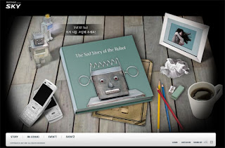 I want to design my interactive site like above reference. User will rollover and click on the item (tool tip will appears and show information). the message behind each navigation button has some hints indicating it. for example, a glass of water with fake teeth inside; animation showing how Marchie break his teeth by biting on a hard shell nut. Once user has click on one of the buttons, it can be an animation, static images with storyline, or animated images.
I want to create an interesting interactive website that is visually engaging and attracting. not much word. no help button (as i want to make it easy to navigate and try to avoid confusion)
What's my site about?
- It is an interactive site promoting Marchie and introducing his background
- where does he come from?
- why is he here?
- Marchie's past and present ( character development )
- who is his friend?
- what do he like and dislike?
Wednesday, 7 May 2008
learning outcome
- keeping good track and update my RVJ as a proof to my progress and development
- research and look into professional work and compare with my own work
- practice the good principles and jot down the bad principles and try to avoid them in my work
apply technical and analytical skills to the conception and production of a range of visual communication media
- analyse other people work by listing down the good and bad points and reflect on my work
- explain why is it good and why is it bad
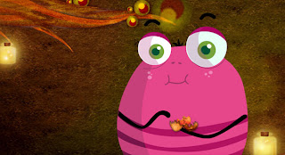
fire flies, the whole scene looks more lively and interesting
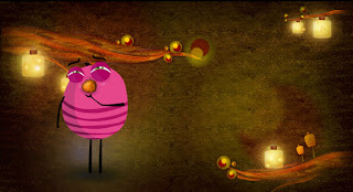 [above] with shadow and add in a soft light to where he stand
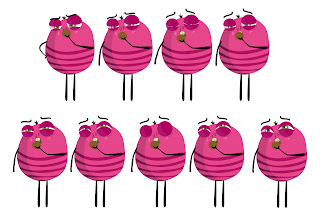 [above] additional scene, sniffing the nut longer with more facial expressions
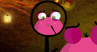
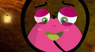
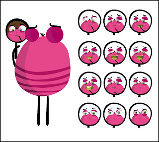 [above] additional scene, mirror scenes, to have a clearer idea of he broke his TEETH!
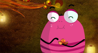 [above] cheat eating way. eat the entire nut and not small pieces
Tuesday, 6 May 2008
case studies
// Tamatown // http://www.tamatown.com/#

good principles:
- toop tips to provide information of what is the button about
- after choosing your choice and finish the tast, we get rewards and password to proceed to the last level (keep us motivated)
- there's always a character giving hints and guide in every section
- take very long to complete those level and need to click all in order to get the correct password for last level
- need to take a lot of guesses; in another words, user will feel less interested and tired
// Peskimo // http://www.peskimo.com/web/microsite/
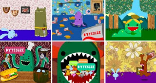
good principles:
- fast loading
- good use of navigation; clear, easy understandable
- good use of sound effects; no annoying background music
- animation a bit jaggy but still get to see the message
(maybe is that what makes the page load faster)
// Locoroco // http://www.locoroco.com/
- fast loading
- nice graphic (vector has smaller file size than images)
- there's a small character will pop up at the bottom right to guide us; giving hints, explain and instruction on what to do)
- a story behind where locoroco comes from and their mission! which is you have to tilt the land to escape from Moja troops
- friends and foe (picture shown and some description)
- downloads and screen shots
- test play (so that consumer can have a picture of how does the game looks like and how fun is it)
- navigation (have to click on the quick nav to show the other navigation; i find it quite annoying for me)
Saturday, 3 May 2008
Evaluation 2
//Action point review //
by Andrew
- i'm not sure that a blog consider as a complete product
- how would you show examples on your principles
- you need to produce something more than just a blog
- the piece needs to be a complete piece or work. i.e. a site that highlights the character
- there are improvement in the animation
- some issues with frame rate. consider some technical reflection (optimization)
- what are the animation principles?
(show tests : weight, timing, spacing, secondary animation) - the blog could be "secondary" - a support to the character and design
// Action points //
After last week work check, my aim of creating a self branding site (blog) is not going to work as blog is something like a daily dairy. It is more to like RVJ instead of a site to promote my Marchie. So i were ask to open the 'Rustboy' site to analyse and compare. Areas that i need to enhance are:
- sounds effects
- file size
- test on different platform as different it gives out different result and may caused animation didnt sync with background music
Sunday, 27 April 2008
next
- a site like peskimo , meomi
http://www.peskimo.com/web/blog.php
http://meomi.com/index.html - some still image and illustrate where does Marchie come from, his living place
- some promotional item to promote my site/ character
New Aims
- a self branding site
- create a 2D animation (without dialouge)
- create a character with simple outlook and visually engaging
Target Audience
Everyone
Principles
- animation should be visually interesting and engaging
- animation should up to professional level
Learning outcomes
- manage my own learning includes self-evaluation through reflection, and take action that result in self development
- keeping good track and update my RVJ as a proof to my progress and development
- research and look into professional work and compare with my own work
- practice the good principles and jot down the bad principles and try to avoid them in my work
- apply technical and analytical skills to the conception and production of a range of visual communication media
- analyse other people work by listing down the good and bad points and reflect on my work
- explain why is it good and why is it bad
- demonstrate a systematic understanding of key aspects of my subject, including acquisition of coherent and detailed knowledge, at least some of which is at or is informed by, the forefront of defined aspect of a subject and or professional practice
- the originality of my character
- a deeper understanding on the principles of animation
- look at cutting edge character (not just look at it but try to apply)
- generate a body of work that is considered to be at a professional level in terms of conception and realization
- evidence of professional work and compare my work with their work to professional level
- demonstrate sophisticated communication and presentation skills
- voice over presentation (maybe)
- VSP (visual schematic presentation)
progress 2
 I have add in some mirror scene to further enhance my animation to make the message look clearer. As my previous comment to my animation are:
- didn't notice marchie broke his teeth
- animation pace is too fast
- marchie's teeth is too small
Marchie enhancement
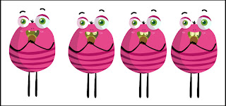 I had done some modifications to my character Marchie's teeth which is to make his teeth looks more outstanding than the original one.
(L to R)
1: Original Marchie (although is cute but he looks a bit evil)
2: Bigger and separated teeth
3: Bigger teeth with a small gap in between (I choose this)
4: Bigger and longer teeth
In the end, I choose to use No.3 which is Marchie with bigger teeth. This makes Marchie looks more friendly, cute and yet look more contrast when he break his teeth. (My first piece of animation, audience hardly noticed Marchie broke his teeth after biting on the hard shell nut)
progress 1
I have made the fire flies flying in the bottle, making the
scene looks interesting and yet bringing life to the animation.
Another modification that i had done was the wall shakes a bit when the nut hits the wall.
3 eyes monster
Evaluation 1
- Background is alright. Make the fire flies in the bottle move randomly will be much more better and interesting.
- Message not clear as in audience didnt notice Marchie broke his teeth when he bite on the hard nut! (Do another cut on the mirror and close up on Marchie's gum and show how he broke his teeth)
- Background music is fine. Add in sound effects on those little little action such as frustrated sound, broken teeth, kicking nut and so on.
- Need to exaggerate the animation and Marchie's facial expression/ body movement/ branches moving/ mushroom moving.
- Eating part (cheating!) make biting shape and eat bit by bit and not one whole nut followed by another one whole nut.
- No shadow on the character (seems floating in the air)
- Nut should have crack when it hits the wall.
Friday, 25 April 2008
character development
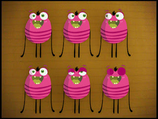
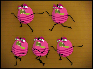 Earlier on, we were discussing on the purpose behind this project. Questions raised during the discussion were:
Q: What's the purpose of this bug?
He is teeth bug. He is here to destroy the teeth. Those who never brush teeth or leave their teeth dirty or with some left over food will become his favourite place to live in; which is he will make a hole in our teeth.
Q: What is he good/ bad at?
He is good at making hole, destroy teeth, and bad at diving (when we rinse our teeth with water, he hates it! he's a bad diver/ swimmer! He name this disaster as his TSUNAMI!)
Q: Who is it for?
This bug is for everyone but target more to younger age children. As i will make this bug involve in some education teaching: Clean teeth.
Q: Why he is here?
He is here to destroy our teeth. So take good care and clean our teeth always.
Q: Personality?
^gone crazy when see food
^evil
^funny


